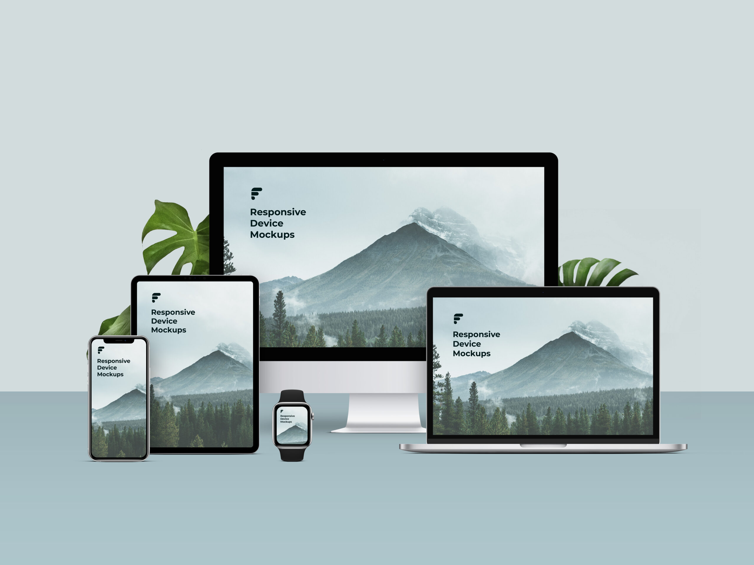
Building websites that work on any device. Responsive web design for better user experience.
Building a responsive website is essential in today’s mobile-first world. Here are some tips to get you started:
1. Use a responsive design template: Building your website with a responsive design template ensures that your website will adjust automatically to any screen size or device.
2. Think mobile first: With so much web traffic coming from mobile devices, it’s important to prioritize mobile layouts and functionality over desktop versions. Make sure your website is easy to navigate and use on smaller screens.
3. Test and refine: Test your website on different devices and make necessary changes to improve the user experience. Continually refining your design can help optimize its performance and keep your audience engaged with your content.
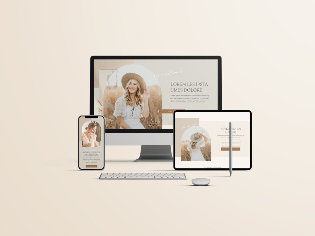
As a freelance web designer, I am passionate about building responsive websites that are both visually stunning and easy to use. I take a collaborative approach to every project, working closely with my clients to create custom designs that reflect their unique brand and vision. With a focus on user experience and functionality, I am dedicated to delivering high-quality, custom solutions that meet the needs of each and every client.
Building a responsive website takes time and effort, but the benefits are worth it. By following these tips and incorporating responsive design best practices, you can create a website that is accessible and user-friendly across all devices. If you need assistance with building your website, please don’t hesitate to contact me at JVDESIGNS. I would be happy to help you create a beautiful and responsive website that meets your needs.